Because healthcare professionals (HCPs) use many other sources of information about medications, they don’t often visit ...
13 Best Practices to Create Better Data Privacy Experiences

Posted by Bob Berry on Nov 18, 2019
Successfully complying with and designing for data privacy regulations has become top of mind for businesses and brands around the world. With GDPR now in effect in Europe, and similar laws in the U.S. like CCPA not far behind, government regulations and reactions from customers across the globe are demanding for companies to create better, more effective data privacy controls. Most brands are not getting this right, and users recognize companies that do it well. We find that customers are prepared to abandon apps and merchants if they feel their privacy is at risk. The consequences of getting it wrong can be immense.
Last year, we conducted primary research to uncover how GDPR aligns with user perspectives and attitudes about data privacy. We recently followed up to dive even deeper and develop best practices for how brands can meet these new user expectations. We talked to users around the country and met with key influencers in the data privacy space to understand what users expect from the apps, sites, and products they use.
Creating transparent, clear user experiences for your customers to control their privacy is the best way to build brand loyalty.
Many of our participants felt overwhelmed by privacy controls and a lack of trust in the products and brands they use due to privacy concerns. Many users said even if they make the right choices and selections, they aren’t confident their data will actually be protected and secure. By creating clearer controls and more transparent privacy experiences, users are more likely to trust your brand to protect them. They will choose your product over others time and time again.
We heard a number of common reactions from users about specific privacy control examples across the board. While products and services differ across industries and functions, there were some basic elements we found were universally necessary to creating better privacy experiences. Make sure you’re considering these best practices at a minimum to meet user expectations and deliver an exceptional experience.
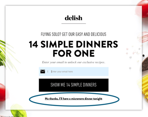 1. Don’t use guilt or shame tactics when collecting customer information
Before we dive into privacy settings, let’s talk about how you actually get customers to sign up with their email to learn more. We’ve seen a number of companies use negative language to shame customers into signing up for email marketing. Some call it the negative opt-out. Others say confirmshaming, but regardless of what you call it, it doesn’t create a good experience for your users. Build trust and respect by offering customers positive options rather than making them feel guilty or foolish.
2. Provide clear entry points
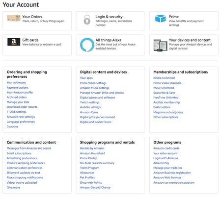
Many of our participants couldn’t even locate data privacy controls to begin with. If they can’t find the menu, it’s impossible for them to feel in control. Here’s an Amazon example where users could not locate the entry point to their privacy controls, or wondered if it was even available to them. Make it easy for users to find these settings with clear messaging and layout.
3. Group related settings for easy access
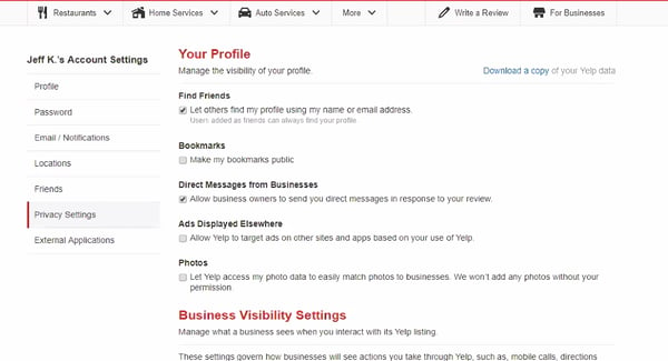
Separate major activities and topics into easily understandable groups, then layer them. This Yelp screen starts with a higher-level menu on the left for easy navigation. Within each menu there are clear categories with red titles, and each individual selection has a description of what it means. This layout keeps things streamlined and clearer for users to navigate.
This Facebook example separates major activities and topics allowing users to see settings in easily understandable groups. This helped our participants tackle one challenge at a time and reduced cognitive load. 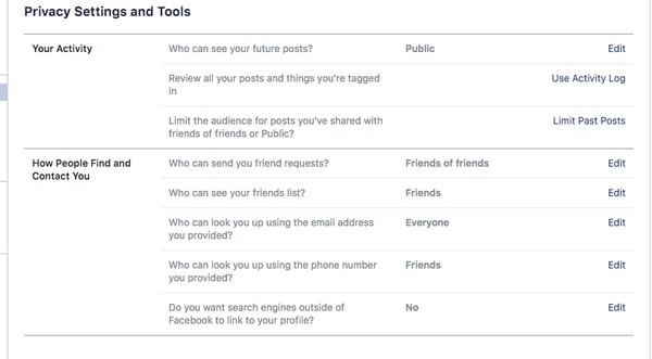
4. Don't overwhelm users with too many choices
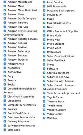
We showed this Amazon menu for controlling marketing communications to our study participants and they had no idea where to start, what was important, or what many of these terms meant. Controlling their settings was not clear and simple, but in fact, highly confusing and unmanageable.
5. Provide clear examples
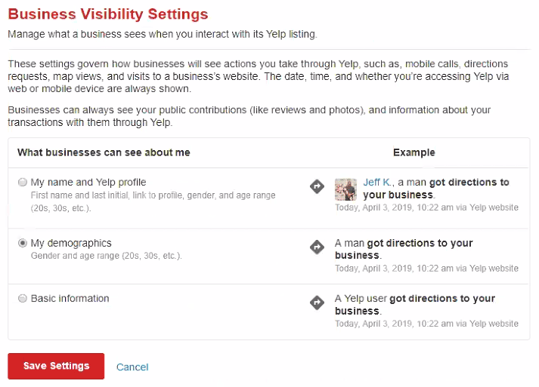
Here, Yelp shows clear real-world situations next to their privacy settings, so people could see how these changes actually affect their activity. Users appreciated seeing what would happen if they made various aspects of their personal information public or private.
6. Use common language
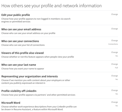
Many users struggle to understand jargon, acronyms, and complex terminology. If you’re not writing your menus and guidelines for everyone, they won’t be able to understand what these options mean, and it’ll only frustrate your users as they try to navigate them. This example uses common, non-technical language that all users understood and felt comfortable with. You can also augment short, simpler phrases with longer descriptions for greater clarity.
7. Use colors, icons, and visual cues
Users appreciated how friendly and inviting this Facebook example looked. The icons also successfully reinforce the text for easy scanning and comprehension. Colors and icons like this can help you break up large blocks of text and make users feel more comfortable. However, remember to watch for accessibility concerns and always be sensitive to color-blind users! We like to use this color blindness simulator as a first step.
![]()
8. Keep it current
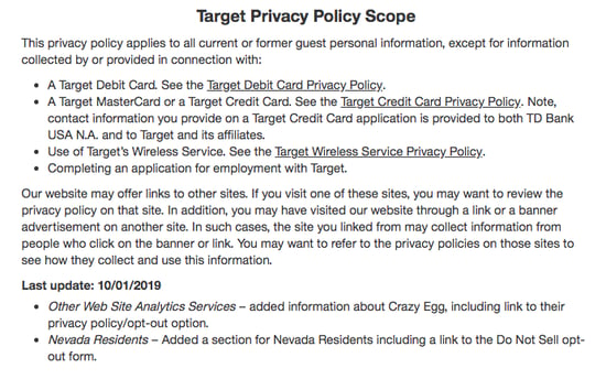
During our study, we explored a variety of websites and apps with end users. We often searched for and reviewed companies’ data policies as a part of this – and occasionally, we found policy statements that were many years out of date. This seriously degraded users’ confidence in the company and they were less willing to share their personal information. Keep your policies up to date, like this Target example, to build user confidence and trust.
9. Build trust with education
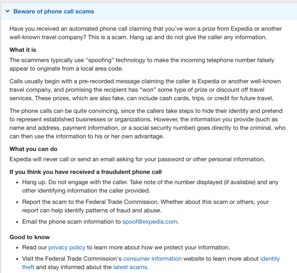
Our research demonstrated that most people don’t understand their own rights to privacy or how companies collect and use their data. One of the biggest opportunities we saw is through educating your customers. Here, Expedia educates their users on the types of travel scams they might encounter and what they can do to protect themselves.
10. Communicate your use of trusted tools and services to build confidence
A number of companies provide technology to increase the security of transactional websites and apps. If you want to build more confidence with users, take advantage of these technology platforms, set them up effectively, and display the badges or logos on your site to show your commitment to data security.

11. Provide automated tools
Facebook offers a “Privacy Checkup” tool to guide users through a number of critical steps. For users who don’t have the time, patience, or skill to manually click on all Facebook’s many privacy options, the wizard will move them step-by-step through what matters most. Providing some automated or guided ways to navigate your site can help users move quickly through the high level settings they need to know.
12. Meet all GDPR requirements and make them accessible to your users
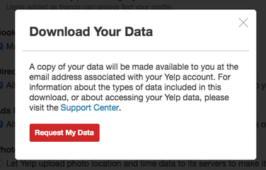
One of the key GDPR requirements is being able to download all personal data from sites and apps. In this example, Yelp gives users clear, easy access to download their data. They do this with simple, short messages on their website, making it clear and easy to find, and then follow up via email with the requested data.
13. Communicate proactively, especially when something goes wrong

Here, Charles Schwab is providing customers and users what they need to know about Schwab policies and approaches specifically, but more importantly, useful information on managing personal security in general.
Obviously, we all strive to prevent data breaches, but sometimes they happen despite our best efforts. When a data breach occurs, make sure to communicate with your users proactively and as swiftly as possible. Nothing degrades user trust more than finding out their personal information was compromised long after the fact.
I can’t emphasize enough the need to test, validate, iterate, and test again, especially when it comes to data privacy concerns. Making sure your users feel confident and educated about their data is critical to creating a great user experience.
Need help navigating your data privacy experience? Contact us!
Bob Berry
Bob Berry, a member of our AnswerLab Alumni, was a Principal UX Researcher at AnswerLab with over 20 years of experience in usability, user experience, customer experience, and a variety of market research disciplines. He has conducted thousands of user testing sessions, focus groups, and user experience research projects over many years, for online marketing services, e-commerce sites, email initiatives, call center systems, e-learning programs, promotional web sites, and much more. Bob holds a Bachelor of Science in Computer Science and Math from the University of Nebraska. Bob may not work with us any longer, but we'll always consider him an AnswerLabber at heart!related insights
get the insights newsletter
Unlock business growth with insights from our monthly newsletter. Join an exclusive community of UX, CX, and Product leaders who leverage actionable resources to create impactful brand experiences.